
그래프 배치
하나의 figure위에 다양한 axes matrix를 생성하더라도
적합한 공간을 배치해줘야 그래프가 올바르게 생성된다.
subplots(행, 열)로 그래프 행렬을 생성하고 [행, 열].plot() 로 그래프를 그려준다.
import numpy as np
import matplotlib.pyplot as plt

x = np.linspace(-1, 1, 100)
y_1 = np.sin(x)
y_2 = np.cos(x)
y_3 = np.tan(x)
y_4 = np.exp(x)

fig, ax = plt.subplots(2,2)

ax[0, 0].plot(x, y_1)
ax[0, 0].set(title='sin graph', xlabel='X', ylabel='Y');
ax[0, 1].plot(x, y_2)
ax[0, 1].set(title='cos graph', xlabel='X', ylabel='Y');
ax[1, 0].plot(x, y_3)
ax[1, 0].set(title='tan graph', xlabel='X', ylabel='Y');
ax[1, 1].plot(x, y_4)
ax[1, 1].set(title='exp graph', xlabel='X', ylabel='Y');

plt.show()>

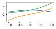
subplot()함수는 행렬을 한번에 생성하는 subplots()함수와 달리 행렬의 특정 위치를 반환한다.
예를 들어 subplot(231)이면 2행 3열의 행렬 중 1번째 칸(첫번째 칸으로, 0번째 칸과 같은 의미)을 반환한다.
함수의 인자로 '행 개수', '열 개수', '칸 순서' 줄때 ','를 쓰지 않고 띄어쓰기도 하지 않는다는 점에 주의해야한다.
ax1 = plt.subplot(321)
plt.show()>
각 위치를 반환 받고 그 다음 plot으로 그래프를 그리면 해당 위치에 그래프가 생성된다.
ax1 = plt.subplot(321) # 3행2열 중 1번째 칸
plt.plot(x, y_1)
ax2 = plt.subplot(322) # 3행2열 중 2번째 칸
plt.plot(x, y_2)
ax3 = plt.subplot(312) # 3행1열 중 2번째 칸
plt.plot(x, y_3)
ax4 = plt.subplot(325) # 3행2열 중 5번째 칸
plt.plot(x, y_4)
ax5 = plt.subplot(326) # 3행2열 중 6번째 칸
plt.plot(x, y_1)

plt.show()>

그리고 아래와 같이 한 위치 안에 여러 그래프를 넣을 수도 있다.
ax2 = plt.subplot(322) # 3행2열 중 2번째 칸
plt.plot(x, y_2)
plt.plot(x, y_3)
plt.plot(x, y_4)

plt.show()>
그래프의 색상
c= ' ' 또는 color= ' '
약어, #RGB값, 16진법을 쓸 수 있다.
선의 형태
linestyle=' ' 또는 ls=' '
dashed: 끊긴 선
dotted: 점선
solid: 직선
plt.plot(x_1, y_1, c='b', linestyle='dashed')
plt.plot(x_2, y_2, c='r', ls='dotted')>

제목
plt.title(" ")
: 하나의 그래프를 작성하고 제목 붙임
axes객체.set_title(" ")
: 각 axes객체마다 제목 붙임
plt.xlabel('x축 제목')
plt.ylabel('y축 제목')
x1 = range(50)
y1 = [value for value in x1]

x2 = range(50)
y2 = [value + 100 for value in x2]

plt.plot(x1, y1, c='b', ls='dashed')
plt.plot(x2, y2, c='r', ls='solid')
plt.title('two lines')
plt.xlabel('X')
plt.ylabel('Y')
plt.show()>

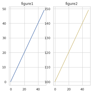
fig = plt.figure()
fig.set_size_inches(10,10)

ax1 = fig.add_subplot(1,2,1)
ax2 = fig.add_subplot(1,2,2)

ax1.plot(x1, y1, c='b')
ax2.plot(x2, y2, c='y')
ax1.set_title('figure1')
ax2.set_title('figure2')

plt.show()>
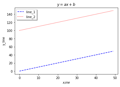
범례
plt.legend(loc='위치')
위치: center, upper right, best 등 (그외 여러 매개변수들은 공식문서 참조)
plt.plot(x1, y1, c='b', ls='dashed', label='line_1')
plt.plot(x2, y2, c='r', ls='dotted', label='line_2')
plt.legend(shadow=True, fancybox=False, loc='best')
plt.title('$y = ax+b$') # $기울임체$
plt.xlabel('$x_line$') # $기울임체$
plt.ylabel('y_line')
plt.show()>
'visualization' 카테고리의 다른 글
| subplot & set (0) | 2022.04.06 |
|---|---|
| matplotlib (0) | 2022.04.05 |